


A brand refresh for Hong Kong craft beer Yau may be unfortunately timed, as the Hong Kong government is threatening to halt alcohol sales in bars and restaurants because it feels that will somehow stem the spread of COVID-19 (although if that is the goal it would seem more logical to force bars and restaurants to close, as many other places have done).
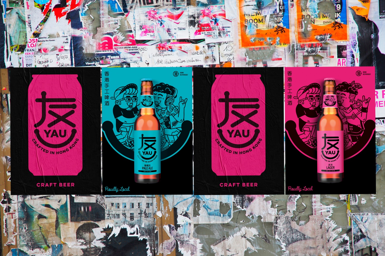
None of the above controversy is the fault of the brand, or the agency that handled the work, Design Bridge Singapore, or Brainrental, the local illustrators who worked on the project. And the redesign provides a dash of cheer amid a terrible situation, as it relies on an upbeat look—with the Chinese character for 'Yau' coaxed into a smile—and local colloquialisms.
|
We covered the original launch of Yau in 2017: Yo, Yau! Carlsberg aims to tap HK craft-beer cravings |
The companies say the work transforms Yau from "a generic Hong Kong craft beer brand into a boldly unique hyper-local expression that embraces the playful absurdities of Hong Kong life".
All right, simmer down.
Design Bridge further explains that ‘Yau' translates as ‘friendship’ in Cantonese, and the word often finds use in playful phrases to describe the character traits of friends. Thus the brand's three varieties are associated with varieties of Yau:
- Bor-Yau: "The kind of friend you watch football with, then might just end up in bed with after."
- Fat-Siu-Yau: "That intensely obsessive friend who is constantly working themselves up into a fever."
- Chu-Pang-Gau-Yau: "Your gluttonous friend who takes eating and drinking to a whole new level."
Adds Tim Siro, ECD at Design Bridge Singapore:
It really is the idea of using ‘Yau-isms’ that is at the heart of the brand. Making these uniquely colloquial terms the focal point of the designs allows us to express the brand in a hyper-local way—something that was missing in the previous branding. Each of the three variants is a 'friend', a different Yauism to explore, and this narrative is continued in the new brand mark, where the Cantonese symbol for ‘Yau’ has been crafted to depict a friendly smile. This is set against a new colour palette of piercing magenta, ultra marine and cerulean blue to further re-energise the brand and ensure it really pings at shelf and on the bar.
Alice Fong, Yau's brand manager, said the use of local market knowledge revitalises the brand, adding, "We can’t wait to introduce people to the wonderful new world of Yau".
|
This post is filed under... Rebranding exercises |


.jpg&h=334&w=500&q=100&v=20170226&c=1)


.jpg&h=334&w=500&q=100&v=20170226&c=1)

.jpg&h=334&w=500&q=100&v=20170226&c=1)
.jpg&h=334&w=500&q=100&v=20170226&c=1)
.jpg&h=334&w=500&q=100&v=20170226&c=1)


.jpg&h=268&w=401&q=100&v=20170226&c=1)
.jpg&h=268&w=401&q=100&v=20170226&c=1)
.jpg&h=268&w=401&q=100&v=20170226&c=1)
.jpg&h=268&w=401&q=100&v=20170226&c=1)